One of the most important parts of any e-commerce store, especially for luxury brands, is the on-site experience. By thoughtfully planning and optimizing your experience on your online store, you can cater to your shoppers better, provide a memorable experience, and sell more. We looked at how Kopari Beauty, a leading beauty brand, set up its on-site experience to be fun, educative, and immersive.
Founded by Hawaiian-born naturalist and certified-organic chef, Kiana Cabell, Kopari Beauty sells a luxurious line of coconut oil beauty products that feel good, smell intoxicating and perform like a dream.
Disclaimer: Every e-commerce store has touchpoints that can be improved. However, for this post, we’re focusing on what Kopari Beauty does right and how you can adopt their strategy for your beauty brand.
If you want us to pinpoint ways to optimize your e-commerce strategy, we’d love to help! Contact us for a site design audit.
15 Ways Kopari Beauty Delivers a Fun and Immersive Experience On Their Luxury Beauty Brand Website
1. Adding different types of messages within the hero image to cater to different types of shoppers
Kopari Beauty engages shoppers from the first hero section. They use the section to showcase their different USPs, letting shoppers know about a new product, collection, and a sustainable effort that they’ve taken up.
This allows the brand to engage different shoppers at the same time. A shopper who is looking for a new product may be enticed by the section about the product and its benefits while a returning shopper may be curious about their charity/sustainable effort.
Kopari Beauty understands that not all store visitors have the same motivations and needs and is able to fulfill their different needs simultaneously with ease.
2. Multiple hero sections to engage shoppers better
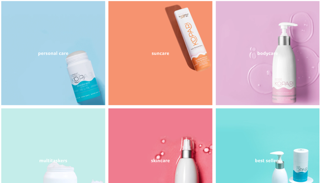
As shoppers scroll down, they are shown a section that nudges them to divert away to different parts of the store. Such a section lets shoppers choose the kind of product they want to buy, whether it’s for personal care, bodycare, suncare, etc.
With such collection-based sections, shoppers can quickly navigate to the category they intended to shop from, guiding them to the products they want to buy based on their need.
3. Build social proof with a product recommendation section
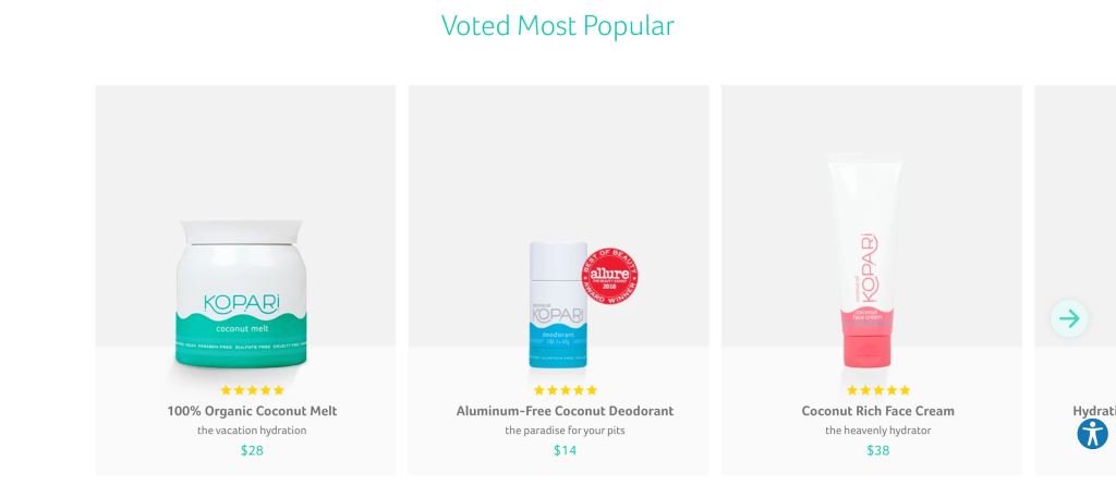
Kopari Beauty has been able to build credibility for its products, even among new store visitors with smartly placed social proof. As shoppers scroll through the website, they are shown a product recommendation section, with the best products on display.
Such a section allows shoppers to get a glimpse of the best products available from the beauty brand and lets them dive into the product catalog without having to navigate to different collections.
4. Use product labels to add credibility
Kopari Beauty is able to show shoppers why their products are worth buying by using product labels that build social proof, either about an award the product received, recognition from a leading magazine, or a label letting shoppers know if the product is new or top-selling.
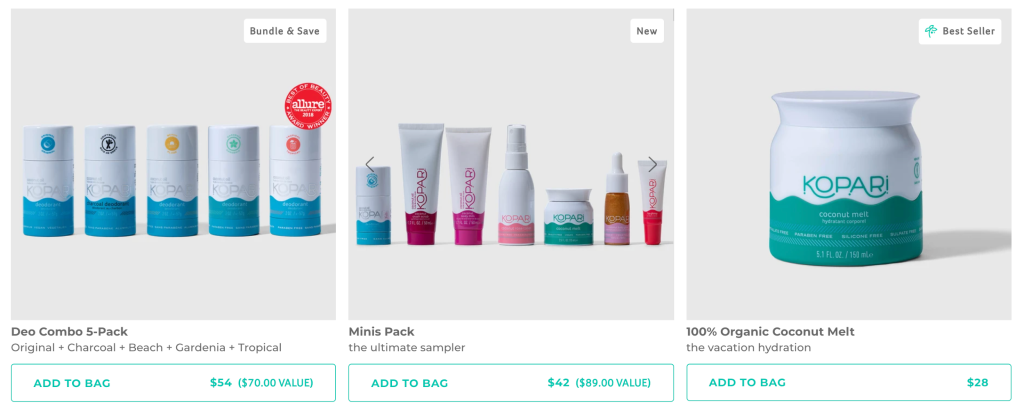
Product labels are a great way to build credibility and illicit specific emotions among shoppers, whether it’s trust or urgency. In fact, product labels have proven to increase sales by 15% for some leading brands.
5. Show benefits in a crisp and engaging section
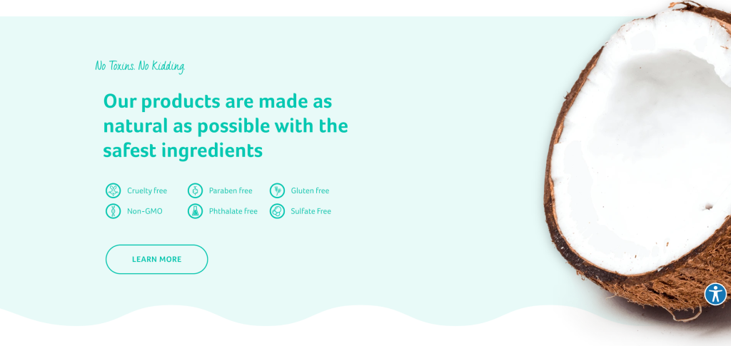
Kopari is built keeping in mind specific values and benefits they hope to have within products that they want to use. They show these benefits in a crisp and engaging section so that shoppers can quickly skim through these. This way, the brand is able to quickly inform store visitors about their products’ USP and why they need to shop.
Shoppers can then choose to learn more about these benefits by clicking on the “Learn More” button.
6. Add to the credibility with quotes from leading experts and editors
Kopari Beauty knows the power of a quote. They’ve added statements from leading experts and editors to validate the effectiveness of their products and further proof their credibility.
This quote section is crisp and easy to read, without any jargon. Instead, the quotes sound almost like talking to a friend, truthful and casual.

Such reviews are an important part of authenticating the legitimacy of a brand and convincing store visitors, especially new ones, to continue engaging with and buying from the brand.
7. Allow shopping through the Instagram feed
As shoppers com to the end of the storefront, Kopari Beauty shows them a glimpse of their Instagram feed. This gives the beauty brand two opportunities:
- Build social proof, showing how active they are online
- Allow shoppers to shop through the Instagram feed i.e. social shopping.
Shoppers can scroll through the Instagram posts and see what the brand has been sharing, and understand who they are through this feed.
Once clicked, shoppers will be able to see the product featured within the Instagram post, open its individual product page, learn more about it and even buy the products.
Social shopping is a growing trend and by letting shoppers browse products through a narrative Instagram feed, they feel more curious to learn about the products that are featured within the post(s) and can be seamlessly directed to shop the items.
8. Clean navigation menu with very few menu items
Kopari Beauty’s minimalism is reflected across the website but, it clearly shines through its navigation menu. They have included only 6 menu items so that shoppers don’t have decision fatigue figuring out which collection to start browsing through. These menu items are based on the type of need that the shopper has. Shoppers who are looking for a deal can easily navigate to the “Bundles” collection.
The brand has a smaller product catalog so, they use the menu dropdown to display a few of their best products. This way, they are able to get shoppers to the prodcut page without even making them view the entire product catalog.

9. Eye-catching pop-up at exit intent
As shoppers move towards dropping off the site, Kopari Beauty shows an enticing pop-up, nudging shoppers to leave their details. The beauty brand does a few things right within this pop-up:
- They use less than 9 words to convey their message, ensuring they don’t bore the shopper.
- They provide an offer— 10% off— to incentivize store visitors to leave their details.
- They reiterate the offer within the CTA button.
- They use an editorial image of their product to make the pop-up more visually-appealing.
10. Clean product catalog with featured products
The product catalog is minimal, with only the product image, the ratings icon, the product name, its price, and the “Add to Cart” button. With a direct add to cart option, Kopari Beauty reduces the multiple page loads that shoppers would usually have to experience.
Shoppers can also browse through all the product pages, see the consistency of the product, and get an idea of how its used.
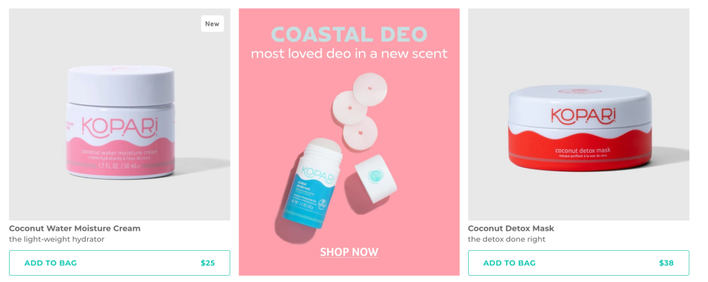
The brand also highlights featured and newly arrived products within a well-designed card that stands out among the rest of the products. This lets the brand put a specific product front and center, ensuring store visitors don’t miss it.
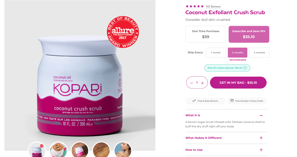
11. Allow shoppers to subscribe to receive the product periodically
Beauty products are usually bought every month or two. Kopari Beauty has been able to identify this purchasing pattern and allows shoppers to subscribe to get the item periodically.
Shoppers are shown an option to subscribe and save a percentage of amount and can choose how often they want the product to be shipped to them. By strategically placing a subscription option, Kopari Beauty creates an opportunity for itself to set up recurring revenue and earn more.
Such a subscription model also frees up the shopper from having to come back to the beauty store time and again and go through the checkout process. Instead, the item is supplied to them in time, making their experience with the brand and its products more memorable and frictionless.
12. Use a GIF to show how shoppers can use the product
While shoppers scroll through the product pages, they are also shown a GIF that illustrates how they can use this product.
Beauty brands are eager to demonstrate their product in use but have a hard time doing so due to high-production costs of videos and the way they impact the site load speed. Kopari is able to smartly navigate this issue by using a GIF instead. With a GIF, Kopari Beauty keeps the website fast-loading while giving shoppers a look at how the product can be used. Shoppers feel more educated just by viewing this, understanding the products consistency and common usage, and can make an informed decision based on it.
13. Show bundle offers within the product page
Who doesn’t love a good offer? Kopari Beauty understands this love for discounts and displays an eye-catching offer section, letting shoppers know how much they’ll save by buying a curated bundle that the team has put together.

Bundles are a great way to remove the decision making dilemma over the different types of beauty products that the shopper would need to buy to build their beauty routine. Such curated bundles allow shoppers to instantly find the best items for their skin and for their wallet, cutting short the time spent browsing through the product catalog and getting them to checkout faster.
14. Show why the product works
While shoppers browse through the product page, they are shown more details about the product, how it helps, its benefits, and what it’s made of.
Besides this benefits list, shoppers are shown a few editorial images which they can scroll through while reading. Kopari Beauty ensures that even in education, they provide shoppers with an enjoyable on-site experience.
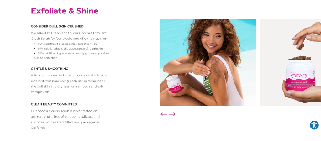
Kopari Beauty prides itself on being a clean brand and they prove this with transparency over the ingredients in each product. They product page shows all the ingredients that a specific product has in it, informing shoppers what they’ll be putting on their body and building credibility for their products.
15. Provide delight at the most pivotal touchpoint— the cart page
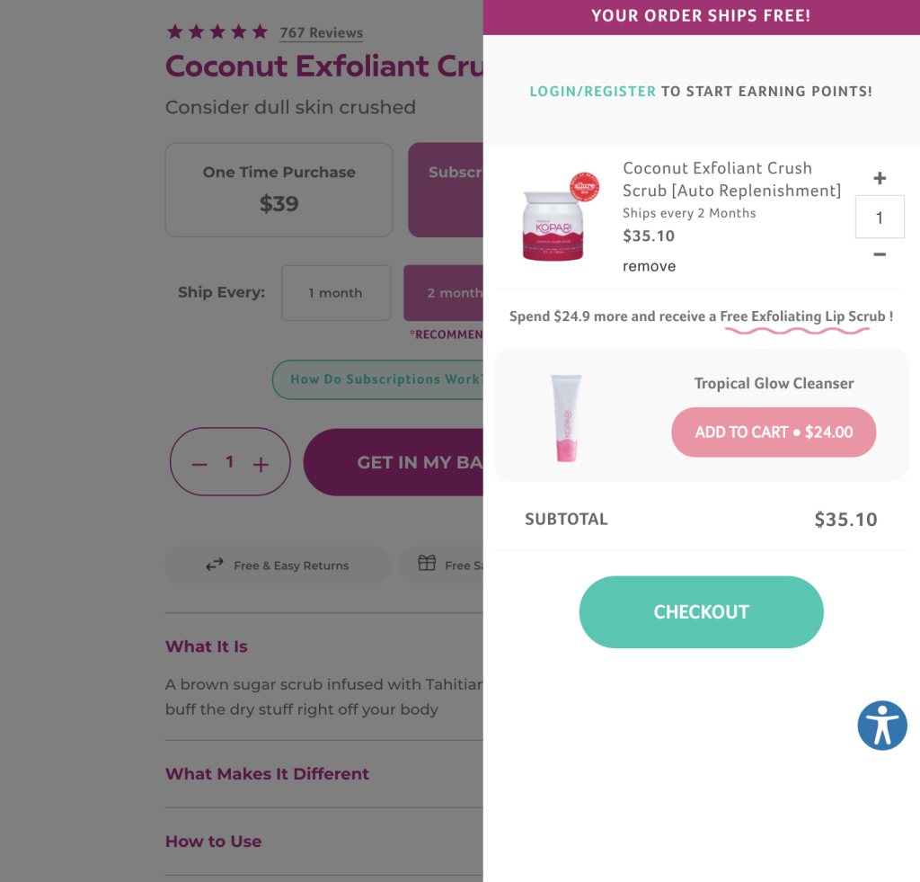
The cart page is one of the most important touchpoints. It’s one of the places where shoppers choose whether or not to continue their purchase. Kopari ensures that they add delight to the cart drawer with a few smartly placed elements, maximizing their opportunity to retain store visitors and nudge them through checkout:
- An announcement bar letting shoppers know that their product is free.
- A message letting shoppers know they can get a free product if they spend a specific amount more.
- A bright “Checkout” button that stands out from the rest of the page.
Kopari Beauty is able to anticipate shopper needs (like wanting free shipping) and understand how to incentivize them, and use this insight to structure their cart page for higher conversions and AOV.
Is your e-commerce store design made for delightful and high-converting shopping experiences?
Your store design makes a huge difference in whether a store visitor ends up buying from you. Kopari Beauty has been able to strike the right balance between delightful and educational, helping shoppers find the right beauty products while making the shopping experience fun.
Following Kopari’s lead, you too can position your e-commerce store design for success, by following a few key best practices:
- Reflect your branding across your website.
- Educate shoppers on why they need to buy your products, including their benefits.
- Prioritize customer experience, making your website accessible, and even providing live chat for direct support.
- Understand ways shoppers want to buy your products and find ways to simplify buying, like with product subscriptions or social shopping.
- Always keep your website clutter-free as luxury shoppers want to focus more on the products and less on the frills.
- Show how your product can be used with simple and interactive images.
- Keep your store navigation easy and intuitive; just as it would be in an offline, brick and mortar store
If you’re looking to identify problem areas within your on-site customer journey or want to revamp your store design to better reflect your brand, you can get in touch with our e-commerce experts.


