eCommerce Store Design Breakdown – Tiffany’s Luxury Jewelry Brand
Read how the global luxury brand for jewellery has designed their eCommerce website for high brand recall and conversions.
Luxury brands online need to be careful of how they curate their on-site presence, ensuring they deliver a memorable and stunning experience to store visitors. To illustrate the best ways to deliver a memorable and tailored experience, we analyzed how Tiffany’s, a leading jewelry brand positions itself as a unique and refined luxury brand.
Tiffany & Co. (colloquially known as Tiffany’s) is an American luxury jewelry and specialty retailer headquartered in New York City. Tiffany’s is known for its luxury goods, particularly its diamond and sterling silver jewelry. It markets itself as an arbiter of taste and style.
Disclaimer: Every e-commerce store has areas of improvement. However, for this post, we’re focusing on what Tiffany’s does right and how you can adopt their strategy.
If you want us to pinpoint ways to optimize your e-commerce strategy, we’d love to help! Contact us for a site design audit.
12 Ways Tiffany’s Delivers a Tailored Experience On Their Luxury Jewelry Brand Website
1. Specks of blue across the site for brand consistency
Tiffany’s is known for its signature baby blue color. They’ve incorporated this color to add highlights across their luxury jewelry brand website, from their announcement bar at the top to the wishlisting icon to their “Add to Cart” button.
This way, they keep their branding consistent without distracting shoppers by adding too much color. The rest of their store design is minimal, with bold and kerned font to reflect their brand’s prestige and a product-focused approach to highlight what makes their luxury jewelry brand unique.
Haven’t got your eCommerce branding in place? Here’s a complete guide on eCommerce branding for you.
2. Promoting an upcoming holiday in advance
Tiffany’s wastes no time in promoting a crucial holiday, informing their store visitors about the special and well-curated collections for it.
With Valentine’s Day coming up, Tiffany’s transformed their storefront mid-January, displaying a hero image that reflects the values that shoppers hold onto during this holiday of love.
The luxury jewelry brand is one of the most popular choices during Valentine’s Day and they’ve leveraged this position by getting a headstart on marketing for this holiday.
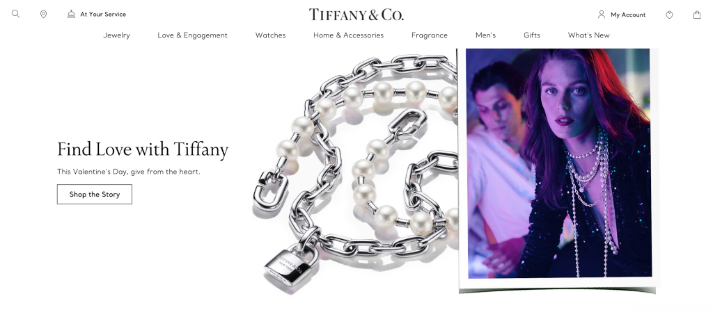
Within the hero section, they haven’t pushed their products too hard. Instead, they’ve used an editorial image that best reflects this holiday and their products’ relationship with it. They then nudge shoppers to ‘Shop the Story’, adding a more interactive and engaging element to their promotion.
3. Easy wishlisting
Besides the hero image displaying their Valentine’s Day promotion, the brand also shows a few product recommendations that are perfect for the holiday, curating them based the products that other shoppers have bought during this time.
Shoppers can easily add these items to their wishlist by clicking on the heart icon. This way, shoppers can go through the entire catalog and add items to their wishlist so they can later evaluate these items to pick what suits them best.

All these wishlisted items can then be accessed through the Wishlist icon from the menu bar. When hovered over, the wishlist icon expands into a dropdown, displaying all the products the shopper has saved.
Shoppers can also open up the page with all their saved products by clicking on the wishlist icon. They can then compare prices and make a more informed decision.
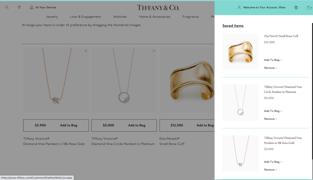
This is especially important for aspirational buyers who look up to the brand as their ultimate purchase.
4. Selling through stories
Another unique part of Tiffany’s is their ability to add a narrative to their shopping experience. Shoppers are easily captivated through a section that lets them learn about more a specific product. They can view the product image and read a snippet about it before they are directed to a dedicated page that dives deep into the story behind the product.
Through images, quotes, and a delicate brand voice, the brand conveys what the product means, highlights why it’s special, and shares the inspiration behind it. Once shoppers reach the end of the story, they are bound to end up shopping for the product/collection.
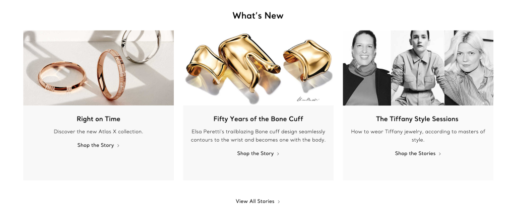
As luxury brands, you’re catering to just discount shoppers. You’re catering to people who want to associate with your brand’s lifestyle on a day to day. Your brand’s products are a lifestyle to them and that’s why your story is of utmost importance.
5. Let shoppers browse based on categories
As shoppers scroll down on the luxury jewelry brand’s storefront, they are shown a few categories, allowing them to dive deeper into the website based on the type of jewelry they want to buy.
Such a section on the storefront is helpful for shoppers who weren’t engaged by the promotion or the product recommendations displayed towards the top of the page.

6. Showcasing their stellar customer service
Tiffany’s prides itself on its thorough and timely customer service. The luxury jewelry brand has set up a section on their storefront, showcasing the different ways that they elevate the experience for shoppers, from complementary returns to personalized service to their iconic and well-branded blue box.
For new store visitors, seeing these different unique elements that add to the experience of shopping from the brand can encourage them to stick around and continue shopping from the brand.

High-value product brands, especially jewellery, need to ensure their customers do not face pre or post purchase anxiety. Since they’re investing so heavily into the products, they need to feel reassured from day 1.
7. Dedicated care page with instructions on how to request repairs
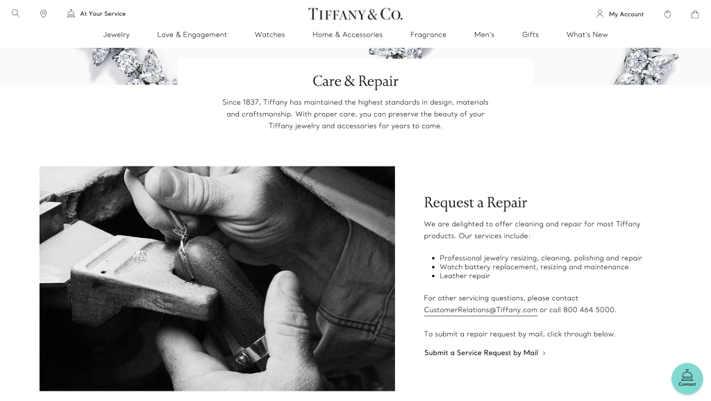
Jewelry tends to break or lose its shine. Tiffany’s isn’t just known to sell its products but also get customers to continuously return to their luxury jewelry brand website. They have a dedicated page that details their process in caring for and repairing their pieces, and how their shoppers can request for such services from the luxury jewelry brand.
Having such a page provides more transparency to shoppers and makes it easier for them to follow through on the instructions to repair and bring back the shine that the product had when they first bought it.
8. Minimal and product-focused catalog
When shoppers land on the collections page, they can browse through the different products within the collection with ease. Tiffany’s removes all clutter from the catalog page, showing only the product images and the search filters so that shoppers have a pleasant and visual shopping experience.
This way, shoppers can focus on finding the jewelry that matches their preferences and styles, rather than keeping an eye on the price tag. If they want to learn more about a product, they can cover over the product image to see the name of the item and its price.
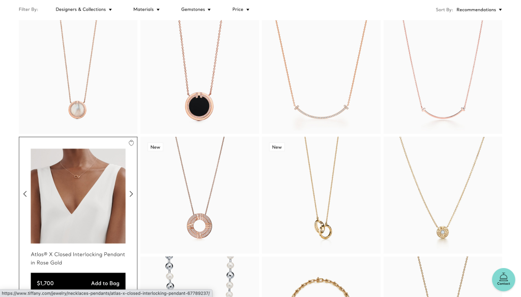
Despite selling high-ticket items, Tiffany’s ensures that their price tag doesn’t faze their shoppers by keeping it hidden until the shopper starts to consider buying the product.
9. Ability to check in-store availability
Many shoppers want to try out jewelry before they buy it. Many shoppers on luxury jewelry brand websites end up dropping off because of this need that they typically can’t fulfill.
However, Tiffany’s has found a workaround. They allow shoppers to check for a specific product in-store. Shoppers can click on the ‘Find in store’ link and start searching for their city, state, or zip code to find the nearest Tiffany’s store.
This removes any doubt over whether the product suits them and instead, shoppers would be directed to the nearest branch of the luxury jewelry brand.
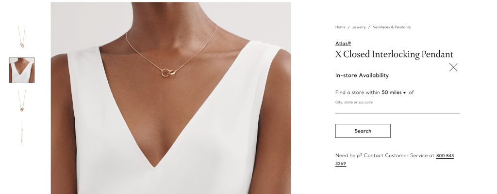
Tiffany’s is constantly looking for ways to deliver ease in shopping for their expensive catalog of products and this is one of the ways they simplify shopping experiences.
10. Easily hint others to shop the item
One of the most unique features available on the luxury jewelry brand website is the ability to send hints to loved ones about pieces that caught their eye. Such a function is perfect for couples who are shopping for their engagement or wedding or even to hint at partners for special occasions.
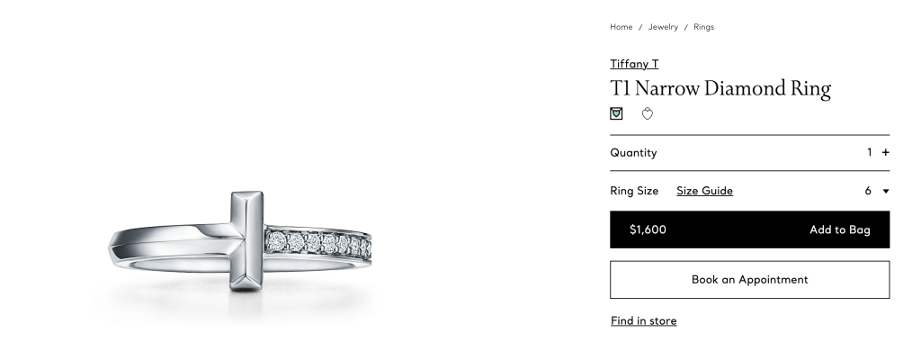
Shoppers can click on envelope icon to send a hint to their loved ones. They are then shown a pop-up where they can enter the name of their loved one and send a note with the link to the product page. With this, shoppers can share products they like with their loved ones with ease.
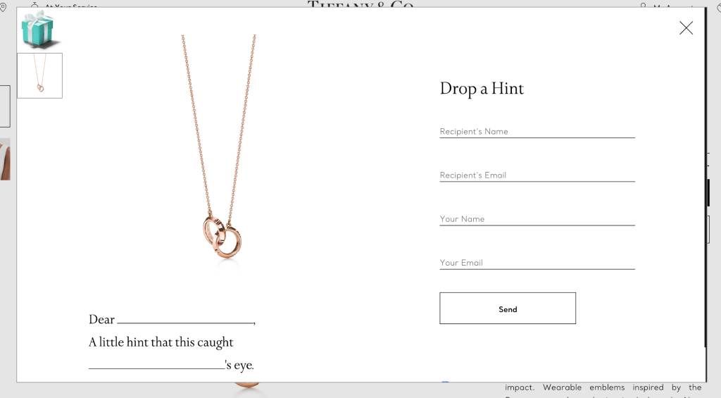
Tiffany’s knows exactly how to create a special and memorable experience on-site with such intricate and detailed features.
11. Get custom engraving on the product
Shoppers can also get the product they intent to buy engraved, either with their initials or with a custom text. On the product page, Tiffany’s allows shoppers to choose a custom engravement. Shoppers can choose the type of engravement, what text they want, and even the font of the engraved text.
The luxury jewelry brand allows shoppers to preview how the engravement looks and review the pricing and appearance before adding the product to their cart.
Usually, getting a product engraved is a tedious process. Tiffany’s makes it fun with a straightforward and interactive option menu, providing limited options to remove decision fatigue for the shopper.
12. Reach out to customer care with the click of a button
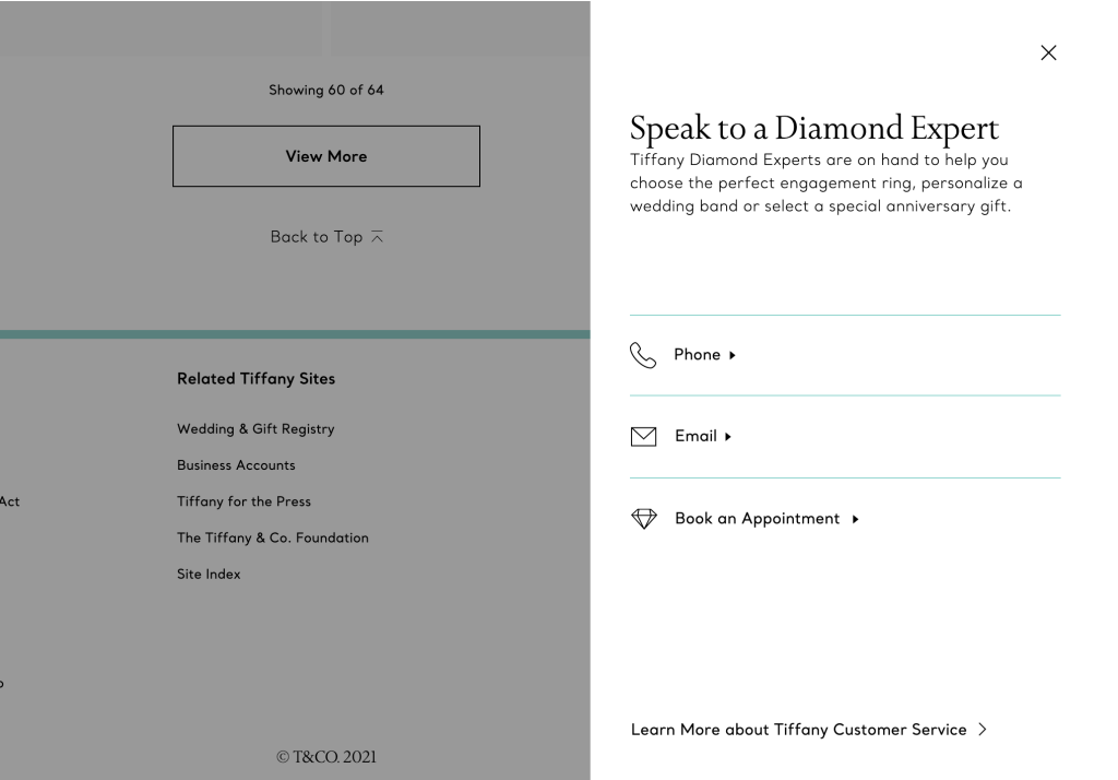
Tiffany’s has a sticky customer care button at the bottom right corner of the website. This way, shoppers can reach out to their team of experts to help them find the right jewelry. They also give quick links to different ways shoppers can contact their team, either via phone, email, or even through in-person appointment.
The brand prioritizes customer support and this is apparent through the different ways it makes it easier for shoppers to access the customer care details on-site.
13. Gifting made easy
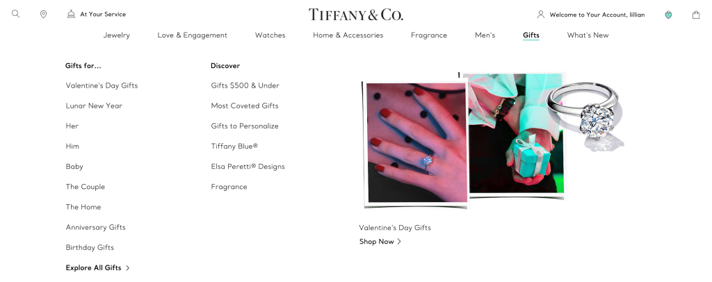
Tiffany’s has recognized that one of the common reasons that visitors land on their page is to gift their products to others, whether it’s a spouse gifting their partner or family gifting jewelry for their loved one’s milestone.
They added a structured menu, displaying key categories that can help anyone gift their loved ones appropriately, whether it’s for Valentine’s Day, anniversaries, birthdays, or even based on the product price.
This way, shoppers don’t have to browse through other collections but can instead, be guided through collections curated for these gifting purposes.
14. Customer account page made simpler
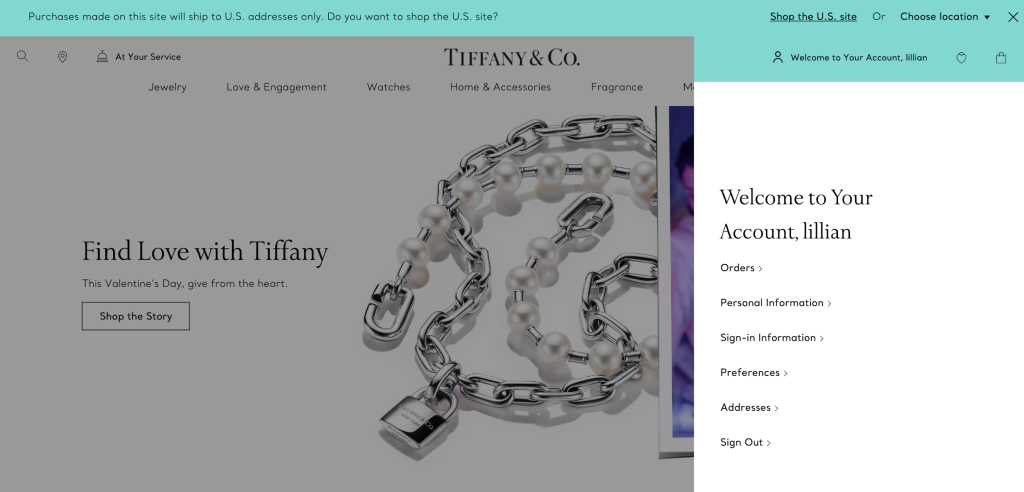
Tiffany’s allows shoppers to access their customer account from any part of the store. Shoppers can hover over the “Welcome to Your Account” text to view a list of quick links they can open. Whether they want to view their Orders, Addresses, or more personal information, Tiffany’s simplifies the process, providing more transparency to shoppers.
15. Clean and easy checkout page
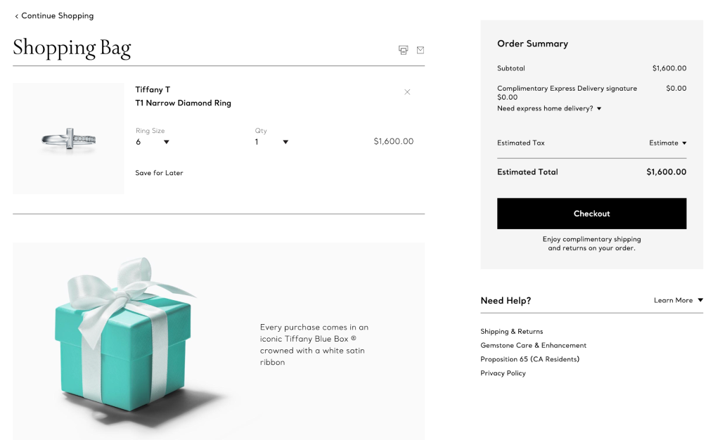
Once shoppers add items to their cart, they can view their order summary on the checkout page, review the product details, like size, quantity, color, and price.
The checkout page is clutter-free, allowing shoppers to skim through the important details about their order before they proceed to buy the item. The luxury jewelry brand also provides quick links to information like about shipping, returns, gemstone care, etc. Having such a compact list of links allows shoppers to quickly review any questions they have about when the product would reach them or if they are eligible to return the item.
Is your e-commerce store design made for frictionless and engaging shopping experiences?
Tiffany’s ensures that they’ve created a seamless and elevated experience on-site with consistent branding and personalized customer care, making sure that shoppers feel like they are within their physical store.
When setting up your store design, it’s crucial to think of what values you want to deliver through your on-site experience, what customers expect from you, and how you can translate your in-store experience to your website. Tiffany’s was able to deliver consistency with their service and create a minimal and stunning experience for store visitors..
Here are a few takeaways for you, based on how Tiffany’s and other such luxury jewelry brand websites have positioned themselves:
- Reflect your branding across your website.
- Make it easier for shoppers to access your stellar customer support team and make it a custom and one-on-one experience.
- Understand ways shoppers want to engage with your products, whether it’s wishlisting, sharing the product with other people, etc.
- Always keep your website clutter-free as luxury shoppers want to focus more on the products, less on the frills
- Make sure you have included all the important product details that reflect the value you bring to potential customers
- Keep your store navigation easy and intuitive; just as it would be in an offline, brick and mortar store
If you’re looking to identify problem areas within your on-site customer journey or want to revamp your store design to better reflect your brand, you can get in touch with our e-commerce experts.


